

Nobody warns you how much a front door color can bother you once you’ve gotten it wrong.
The matter isn’t how you just chose the non-ideal sofa; there’s a problem on the inside of the household when in reality, which is invisible even to the outer world. For you see, a terribly designed front door color scheme just displays and greets the ones who enter every moment. In fact, it’s one of the first traits that people notice about your household and the one they see before leaving it. Getting it right matters more than most people realise until they’ve gotten it wrong.
The good news is that choosing a front door color isn’t actually difficult. It just requires looking at the right things in the right order, which most people skip because they go straight to choosing a shade they like before they’ve properly looked at the house they’re putting it on. Here, Horizon Windows will guide you on a practical matter regarding such a case.
The House Comes Before the Colour
Personal taste is valid. But personal taste still has to work within the reality of the building it’s being applied to.
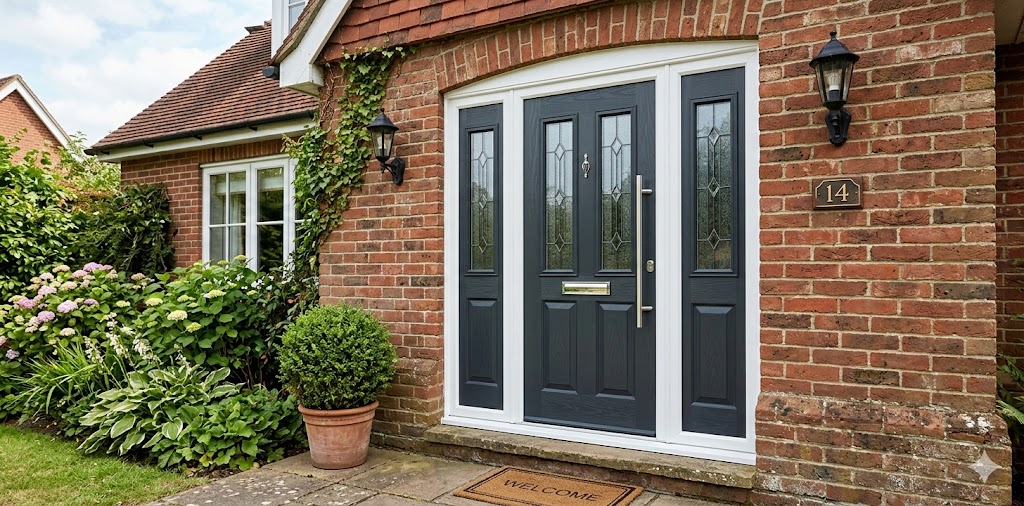
A warm red brick house and a white rendered house need completely different things from a front door. A Georgian terrace and a 1970s bungalow have different visual proportions, different material textures, different everything and the door colour that looks genuinely considered on one can look genuinely wrong on the other.
This is why starting with the house rather than a favourite colour is always the smarter move.
Traditional properties. Anything Victorian, Georgian or Edwardian has been going well with the same colour families for a very long time. Deep red, classic black, hunter green, navy blue. These aren’t the safe or boring choices. They’re the ones that have stayed around long enough to prove they actually belong to that kind of architecture. They work with the brickwork, the proportions and the original character of the building.
Modern and contemporary homes can absorb bolder decisions. Charcoal, slate grey, teal, dark wood tones. These suit clean lines and minimal facades without competing with them. Cottages and country-style homes tend to pull toward natural, quieter palettes. Sage green, dusty blue, terracotta. Colours that feel like they belong to the landscape rather than sitting on top of it.
None of this is a strict rulebook. But it removes most of the guesswork before a single sample gets held up.
Look at the Whole Exterior, Not Just the Door
Here’s where a lot of otherwise good decisions fall apart. Someone finds a colour they love, it looks great on the door in isolation and then they step back and realise it has nothing to do with the rest of the house.
The door sits within a complete exterior picture. Wall colour, roof tiles, window frames, guttering, paving, garden, all of it is visible at the same time as the door. The colour chosen has to make sense within that whole picture, not just when the door is looked at on its own.
What works consistently is contrast that’s deliberate rather than accidental. A door that’s too close to the wall colour loses definition. The entrance dissolves into the facade and the house loses its focal point. A door that contrasts too hard feels like it belongs to a different building entirely.
The trim is usually the most useful reference point. On a lighter house, a darker door anchors the entrance and gives it weight. On a darker exterior, something slightly lighter creates the definition needed without starting a visual argument with the walls.
Light Does Strange Things to Colour
This catches people out more than almost anything else in the whole process and it’s entirely avoidable.
A colour that looks perfect on a sample card in a bright shop or in a photo on a sunny afternoon can look completely different on a north-facing door in winter light. Warm tones shift in overcast conditions. Cool tones can go strange in deep shade. Dark colours absorb light differently depending on the direction the door faces and what time of day it is.
The fix is simple and it just requires a bit of patience. Paint a section of the actual door or at least a large board held up against it and look at it across different times of day over a couple of days before deciding. Morning light, afternoon light, overcast conditions and artificial porch light at night, if there is one. A colour that holds up across all of those conditions is the right colour. One that only looks good in one specific light is going to cause problems.
Hardware Is Part of the Decision
A front door colour without thinking about the hardware is a job half done.
The handles, letterbox, knocker, house numbers, all of it is visible at the same time as the door and all of it interacts with the colour. Brushed nickel and chrome sit well against cooler, darker tones. Antique brass and bronze find their natural home alongside warmer, earthier colours. Black hardware works across a wide range and is especially clean against lighter doors, where it creates a sharp, confident contrast.
On a quality composite door, these details show up clearly because the surface itself is better. The colour lands cleaner, the hardware sits against it more precisely and the whole entrance looks more deliberate.
On Trends and How Fast They Age
Colour trends move through home design quickly. Mustard, burnt orange, dusty pink, sage. Each has had its moment, and each has dated on the front doors that committed to it fully.
For anyone who changes their mind often and enjoys updating the look of their home regularly, trend colours are perfectly reasonable. For anyone who wants a front door that looks right for a decade rather than a couple of years, the classics are classics for a reason. Black, navy, deep green, charcoal, dark red. These have been working on front doors across completely different design eras. They don’t feel dated because they were never really trendy to begin with.
A time-specific colour can quietly work against a sale without the seller ever identifying why.
Conclusion
Four questions answered honestly get most people to the right decision. What does this particular house and its architectural style actually call for? What does the existing exterior palette, walls, roof, and frames need from a door colour? How does the shortlisted colour behave across different lighting conditions? And what hardware finish brings the whole thing together?
Answer those with the actual house in mind rather than a favourite colour, and the right choice tends to become obvious.
For anyone considering a new door alongside a new colour, composite doors from Horizon Windows are worth a look. Our composite doors have solid construction, a good colour range, and finishes that make the whole decision easier from the start.